Everything you need to represent Amba: color, logo, typography, icons and photography. Built for partners, press and our own team.
The wordmark, clear space and lockups.
Open → PaletteButter, ink and a spark of blue.
Open → TypeSF Compact, set in caps.
Open → LayoutMargins, gaps and radius.
Open → SymbolsSF Symbols, monoline and native.
Open → SystemBlue number dots and flat surfaces.
Open → ImageryWarm, candid, lived-in lifestyle.
Open → MessageThe words we lead with.
Open →The core message for headlines, pitches and press. Tap to copy.
One heavy, friendly wordmark set in Chivo Bold. It works in ink on light, white on ink, and white on blue. Don't stretch it, outline it, add effects, or set it on a busy mid-tone.

A dimensional, friendly balloon mark for use across social channels, campaigns and playful contexts. Keep the full image intact — do not crop into the letters or place over busy backgrounds.
Butter is the canvas. Ink carries the words in pure black. Sun is a solid, saturated yellow for punchy highlights. Signal Blue is the spark of joy and action, used sparingly. Coral and moss are friendly accents for illustration and detail. Tap a swatch to copy its hex.
One typeface does the work: SF Compact. Headings and subheadings are set in caps; body stays sentence case. The wordmark is the only exception, set in Chivo Bold and kept in its own mixed case.
Space is part of the voice. Generous margins, tight component gaps, and a single corner radius keep the brand calm and consistent.
Icons come from Apple's SF Symbols, the same set the app draws on. Monoline, rounded, weighted to sit beside the type. Pull the exact symbol from the library and keep one consistent weight across a screen.
Numbered steps and lists use a blue dot with the number knocked out, so it picks up whatever sits behind it. A small, friendly counter used across the brand.
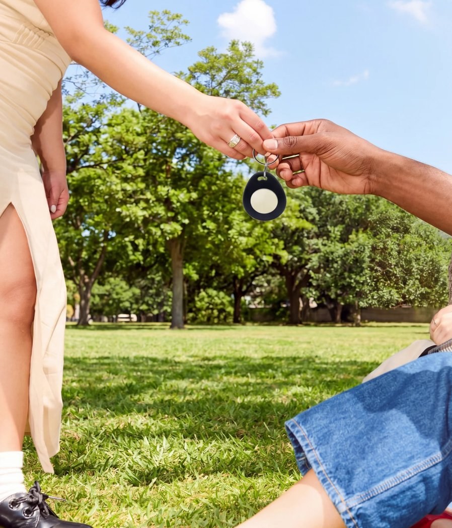
Photography is warm, candid and real. Natural light, soft film grain, true moments between people. Relaxed and joyful, never staged or stocky.


Contemporary lifestyle photography, candid and energetic, premium commercial advertising aesthetic, authentic human warmth, vibrant yet natural color grading, bright daylight, soft high-key lighting, clean highlights, subtle filmic contrast, optimistic and youthful mood, spontaneous documentary feel, shallow-to-medium depth of field, crisp editorial sharpness, dynamic composition, slightly wide-angle perspective, immersive point of view, natural gestures and genuine expressions, fashion-forward styling, diverse modern casting, airy negative space, polished brand-campaign quality, social-first visual storytelling, premium magazine editorial meets lifestyle campaign, rich skin tones, luminous atmosphere, fresh and approachable, professionally photographed, high resolution, contemporary Gen Z / Millennial visual culture, natural imperfections preserved, elevated realism, premium consumer-brand photography. Ultra-detailed, professional photography, commercial campaign, editorial lifestyle imagery, natural light, cinematic color science, authentic candid moment, premium advertising quality, 85mm and 35mm hybrid aesthetic, shallow depth of field, clean background separation, award-winning lifestyle photography.

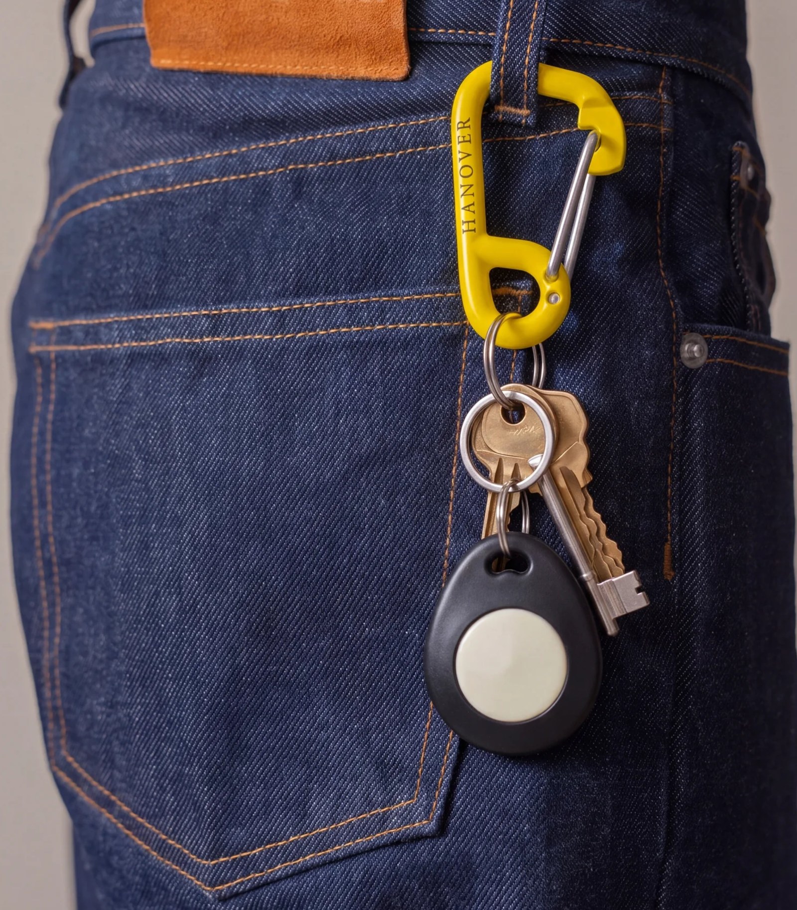
The tag is the brand made physical: a small object you keep close and pass to a friend. It lives in the world, not behind a screen.


A translucent orb with a warm, glowing core. It reacts to how the day is going and gives the app its personality. The character lives inside the app only. It is not used in the logo, advertising, or other brand materials.


Amba sells what you get back, not guilt or discipline. Short, human, a little witty. We invite, we never lecture.